
Illustration and Designs for the Brazilian Naginata Team Tenugis. (this is an ongoing project).

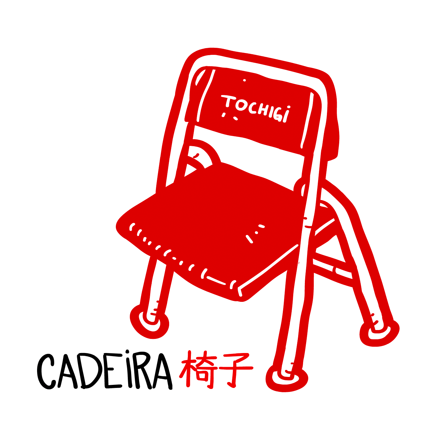
The tenugi is a traditional cloth worn beneath the men (helmet) that serves both practical and cultural purposes in japanese martial arts. Practically, it absorbs sweat during intense practice, cushions the impact of strikes to the head and also provides a more secure and comfortable fit for the helmet, preventing it from shifting.
Culturally, the tenugi holds both personal and symbolic significance. Often chosen for its meaning or personal connection, and is an integral part of the ritual of preparing for practice, wrapping your head, where all your concentration and part of your energy is located.
It is common for practitioners to exchange Tenugis between opposing teams during tournaments and to give them as gifts in seminars.
Over the course of a practitioner's journey, he ends up with a collection of them.
Brazil hadn't had its own tenugi for decades, and an opportunity arose when a practitioner could get hold of a roll of traditional tenugi fabric and bring it directly from Japan, so for me to take on this task was an honor but also a great responsibility. Looking the tenugis I have and researching online, I've tried to get away from the obvious solution of the vast majority of designs, which is text only or cliche narratives like samurai, Mount Fuji, cherry blossoms, etc...
I came up with three design approaches:
1º Focus on the weapon:
As the name of the weapon is the same as the name given to the sport, the first idea was to work only with the silhouette of the weapon in the colors of the Brazilian flag. Designing in a 3D program, export a render in high resolution and stamp the result on the cloth. So it would be a creation in a modern medium printed in the traditional way on a specific Tenugi fabric. The result was 4 design options:
Side alignment: Focus the silhouette when the weapon are resting. They need to be left aligned on the floor to organize and avoid bending.
So the idea here is highlight the distinguishable part of the weapon between the blade and the handle when is resting.


Rendering only the AOV i could work on the colors on photoshop and create variations, keeping the complex shapes of a 3D render but with a complete 2D look.
Twist: Designing stuff with this weapon is difficult! It's hard to show the whole weapon without it looking like a toothpick, so I made this dizzying loop, drawing the eye to the center of the head.


Routine: I reused the silhouette from practice number 3 routine, which you can check out here:


Fan 01: depicting the weapon's trajectory when swinging:
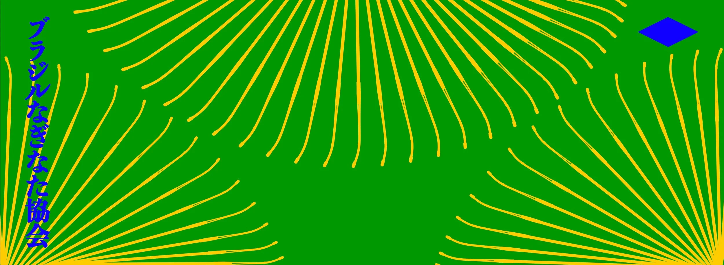


Fan 02: Again depicting the weapon's motion but using only one weapon thinking that by using the Tenugi,the extension of the weapon will create a pattern of stripes on the head:


2º hand drawn Sao Paulo: Created the second design specifically for the Sao Paulo team, where I started my training and keep in touch with them even after years away from Brazil. I hand-drew, with the colors of the city's flag, various objects needed for practice, but also things (and animals) that we only find specifically in the city dojo. I've also hidden 7 easter-eggs with the names of the most hardcore practitioners and the place where we train.

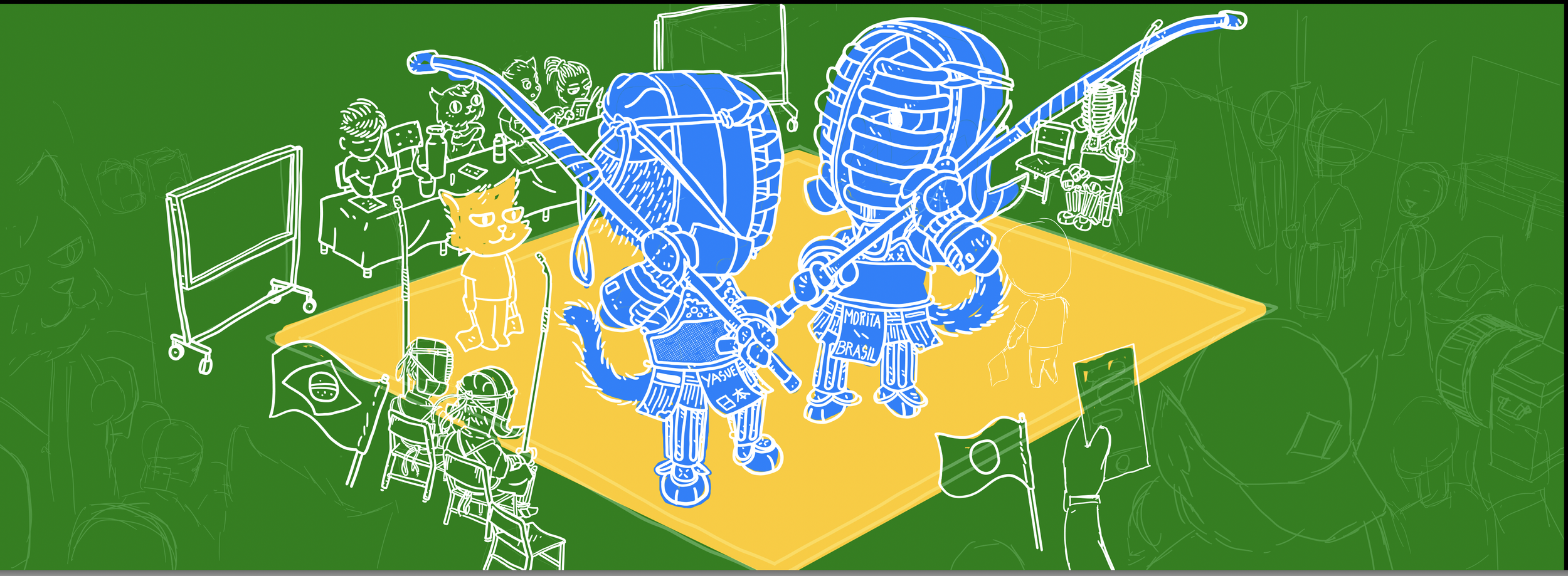
3º hand drawn Brazil: Depicting a complete tournament environment but with a comical twist, breaking the austerity that usually hovers around these events. If you see a competition area from the grandstands, the yellow part resembles the shape of the brazilian flag, starting with this concept I drew the competition area in yellow, the fighters representing the blue ball with the white stripe being the naginatas.It was up to the spectators, staff and practitioners to represent the green of the flag.

Production:

Hand-drawn sketches.

Variation testing

font design.
Final Icons:


Sketching on paper, adapting the drawing in Photoshop, color tests, drawing in digital media:


From 3D design> 300dpi AOV render> Final printable file.


